Salfa
Discover how we rebuilt Salfa’s website to match the level of its product: premium, on the move, and made for women who live in abayas.

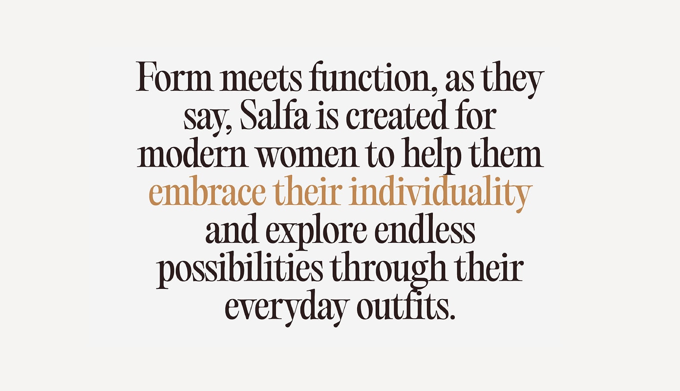
Salfa is a premium modestwear brand focused on modern abayas and outerwear for women who travel, work and move a lot. The product was sophisticated. The old website was not. It felt like a gallery of images, not a brand experience.
The website did not speak to the segment Salfa was targeting. It did not feel premium, it did not show movement, and it did not help buyers imagine the abaya in real life. The brand needed a digital experience that looked editorial, worked fast on mobile and sold the product through motion.
Misaligned audience targeting
Lack of premium and dynamic feel
Weak product storytelling


We centered the experience on how the product moves. Abayas sell better when you see drape, length and fabric in motion. So the site had to be clean, quiet, engaging and easy to browse. The goal was to let the product do the talking, not overload the page.
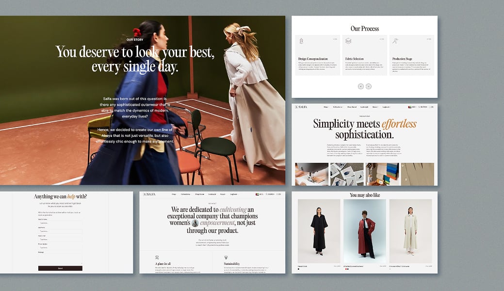
Designed a sleek, minimal interface with strong photography and breathing space. And added short looping videos to product sections so visitors can see how the abayas flow.

Kept navigation simple so users can go from homepage to product in two steps.

Created space for lookbooks and style guides to help shoppers pair pieces for travel, work or events.
To support the new UI we produced assets that showed the product worn and in motion. That solved the flat image problem from the old site and made the collection feel alive.


The redesigned website positioned Salfa closer to a high end modest fashion brand, not a generic boutique.
Longer time spent
on key collection pages.
rise in views
from the homepage to product detail pages.
Stronger perception of premium
among repeat buyers.
Engaging experience
that matches how Salfa wants to be seen.


