Typography: The Unsung Hero of Brand Identity
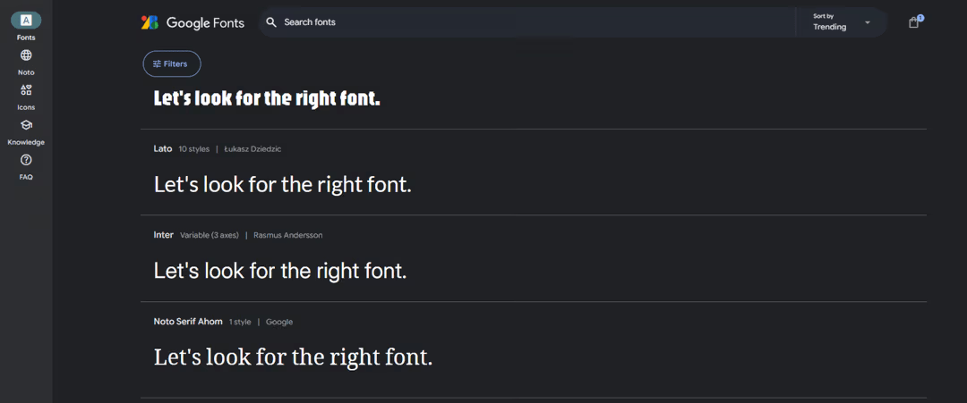
Choosing the perfect font for your brand might feel like picking a needle from a haystack, but it’s not just a design detail, it’s a strategic move that speaks volumes about who you are. Fonts silently express personality, values, and even aspirations. They grab attention, evoke emotions, and create connections long before a single word is read. At Human Saucer, we have honed a methodical approach to unraveling the power of typography and guiding brands toward the right font selection.
Let’s dive into the anatomy of font selection, what different types of fonts communicate, and how brands have flipped the script on perception through typography.
THE ART OF FONT SELECTION: KEY CONSIDERATIONS
Typography drives your brand’s message and enhances its impact. A solid font choice balances aesthetics with purpose. Here’s what to consider:
- Readability:Fonts need to work as hard on small screens as they do on billboards. If people squint, you’ve already lost.
- Relatability:A font should echo the attitudes and expectations of your audience. Trust isn’t built by chance; it’s designed.
- Consistency:Think of your font as the glue that holds your branding together. It should fit seamlessly across logos, packaging, and digital platforms.
- Scalability:Fonts need to scale up or shrink down without losing their magic. They should look as sharp on a business card as they do on a giant storefront.
Once the basics are nailed down, the next step is understanding what different font styles communicate.
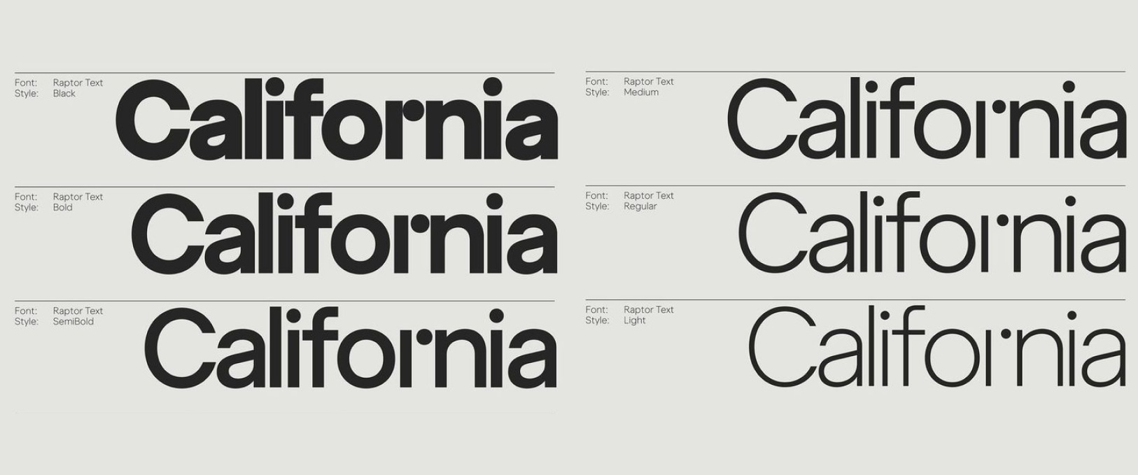
DECODING FONT STYLES: WHAT THEY SIGNIFY
Typography has a way of sneaking in subtext. Each style carries its own vibe, and knowing what they represent makes all the difference.
Serif Fonts: Fonts like Times New Roman and Baskerville project tradition, authority, and reliability. Sans-Serif Fonts: Clean and modern, fonts like Helvetica and Arial suggest simplicity, innovation, and forward-thinking. Script Fonts: Elegant, creative, intimate — often chosen by luxury or artistic brands. Display Fonts: Bold and distinctive, perfect for entertainment or bold campaigns. Now let’s analyze how some brands have used typography to redefine themselves.
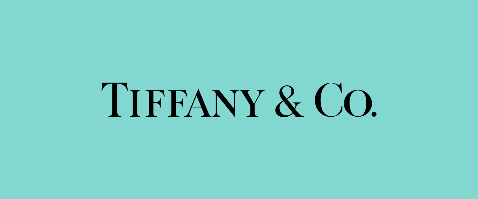
TIFFANY & CO.: A TESTAMENT TO TIMELESSNESS
Tiffany’s serif font is as refined as its iconic blue. Crisp, elegant, and rooted in tradition, the font aligns perfectly with the brand’s luxury ethos
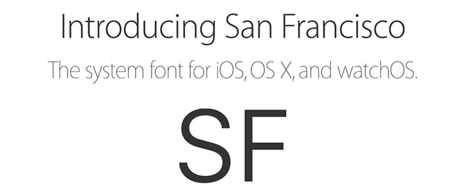
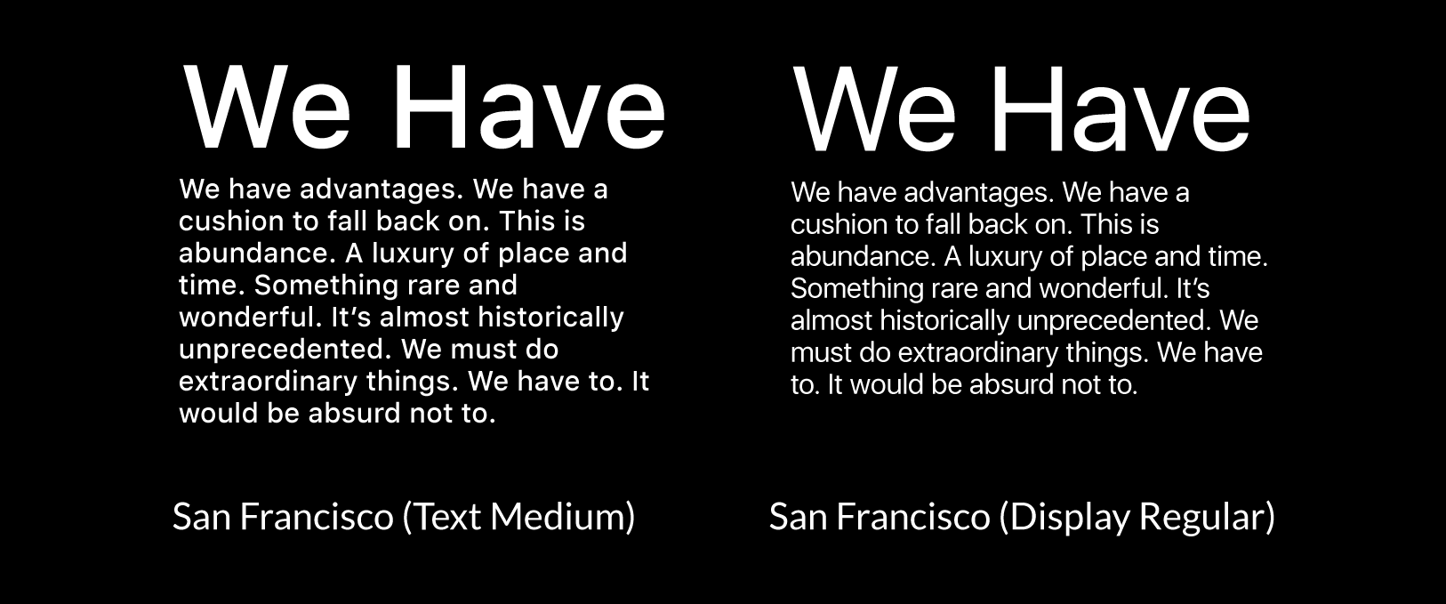
Apple: Simplicity in Every Detail
Apple’s San Francisco typeface reflects its ethos of clarity and innovation. Designed for maximum legibility across devices, it enhances user experience and reinforces Apple’s dedication to sleek, intuitive design.
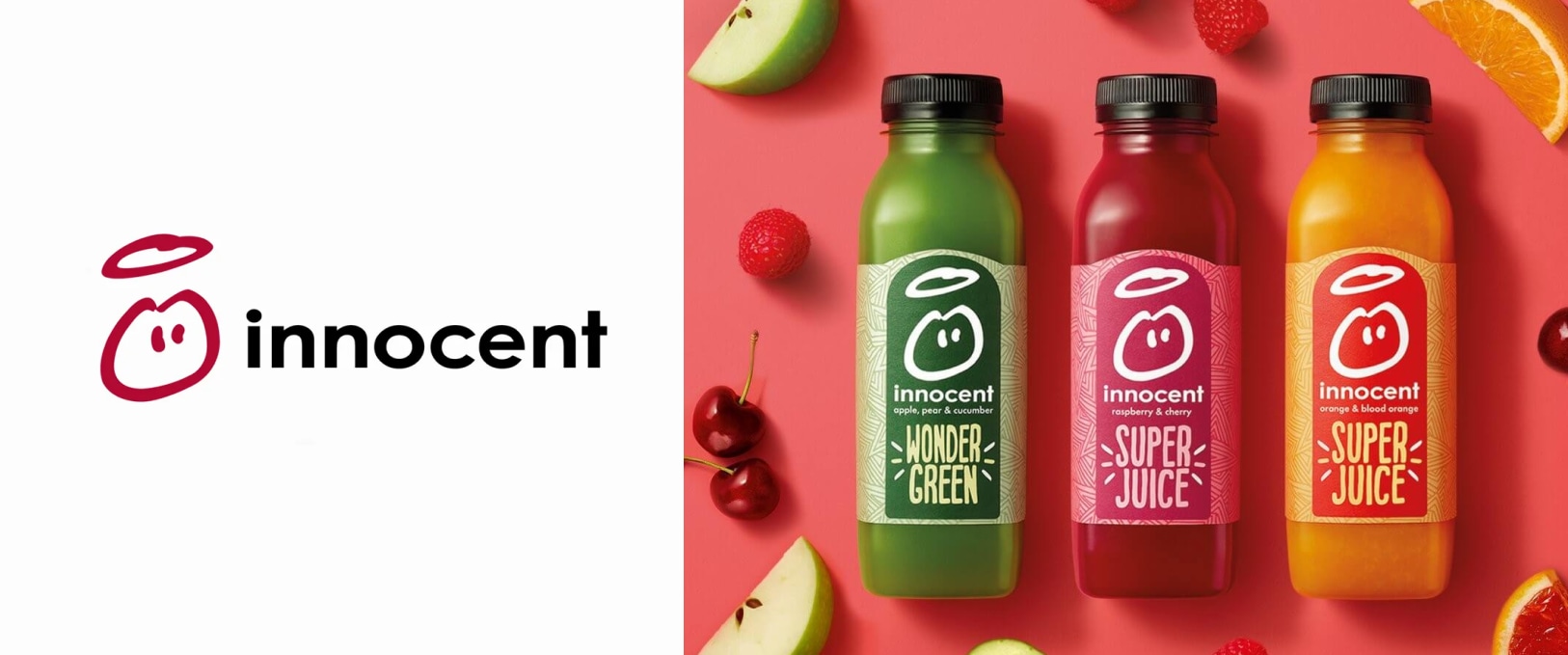
Innocent Smoothies: Warmth in Typography
The rounded, friendly font on Innocent Smoothies’ packaging mirrors its approachable personality. The playful typography connects with consumers, reinforcing the brand’s cheerful and accessible image.
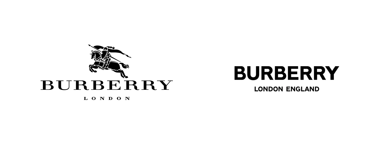
Burberry: Modern Luxury Reimagined
Burberry’s switch from a classic serif to a bold sans-serif font marked a shift in identity. The move modernized the brand, appealing to younger audiences without losing its luxurious appeal.
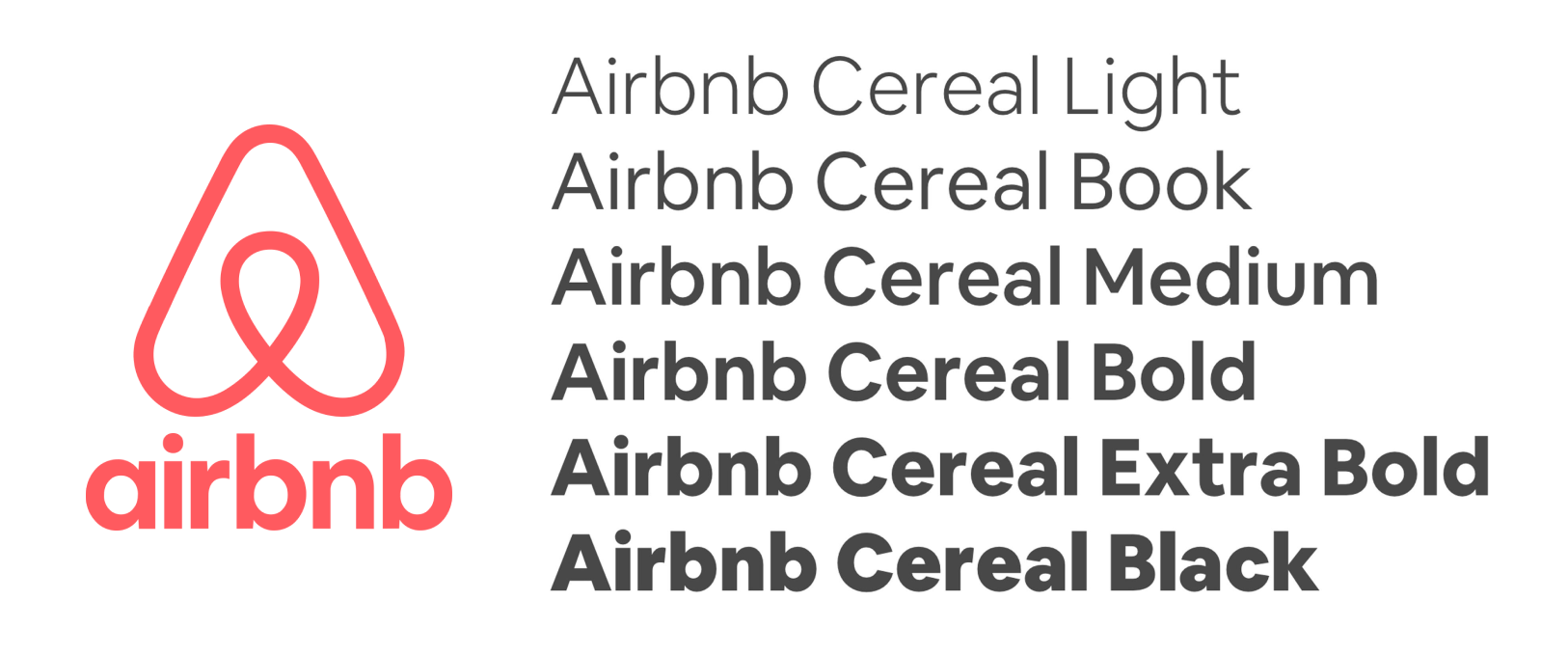
Airbnb: A Font that Feels Like Home
Airbnb’s custom sans-serif font symbolizes inclusivity and modernity. The clean lines and understated elegance echo its promise of belonging, appealing to global audiences with ease.
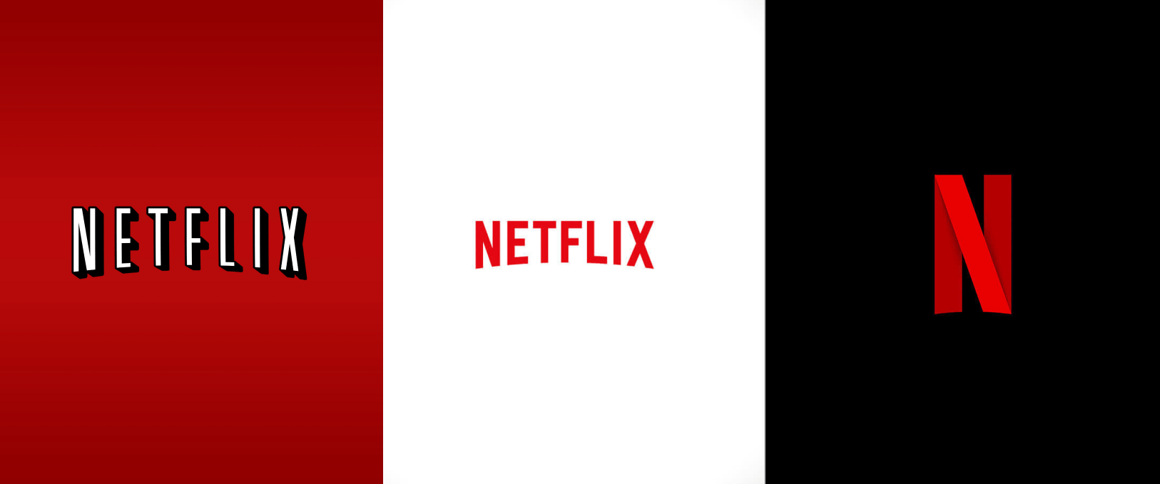
Netflix: Bold Moves in Entertainment
Netflix’s shift from a shadowed serif logo to a clean sans-serif font signaled a transformation into a sleek, cutting-edge entertainment brand. The modern typography reflects the brand’s commitment to innovation and its role as a streaming pioneer.
Airbnb: A Font that Feels Like Home
Airbnb’s custom sans-serif font symbolizes inclusivity and modernity. The clean lines and understated elegance echo its promise of belonging, appealing to global audiences with ease.
THE POWER OF TYPOGRAPHY IN BRANDING
Typography wields immense influence in shaping a brand’s identity. Fonts don’t sit on the sidelines; they lead the charge in shaping perceptions, emotions, and connections.
Brands like Tiffany, Apple, and Burberry have proven that typography can lead transformations, redefining how they’re perceived and solidifying their place in the market.
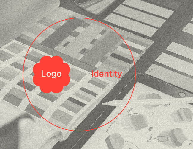
Beyond the Logo: How Human Saucer Builds Meaningful Brand Identities
In a world saturated with brands vying for attention, it’s easy to reduce branding to a single visual: a logo. But we understand that true branding is an entire ecosystem of ideas, values, and experiences that form a powerful, lasting connection with your audience.
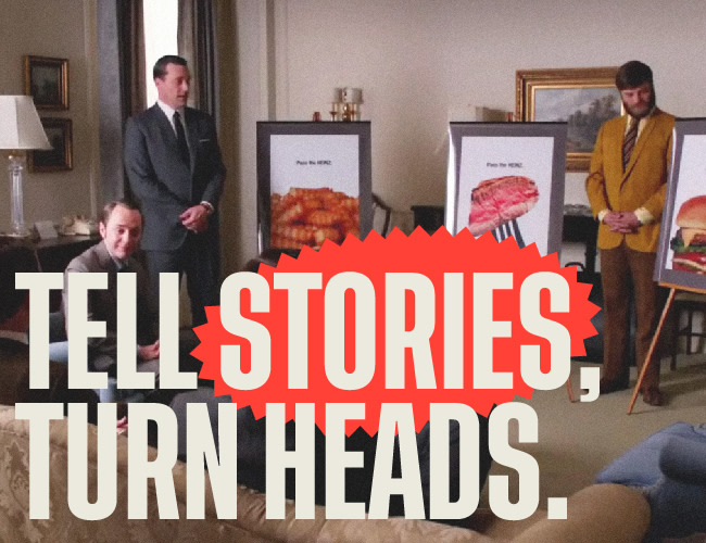
How Great Brands Use Storytelling to Create Meaningful Relationships
Storytelling has become an essential element of brand strategy, forging a vital connection between brands and their audience. When brands share stories that mirror their audience’s values and experiences, they become more relatable. It’s like finding a friend who just gets you. That connection builds trust and lays the groundwork for relationships that last. Below, we’ll explore how some of the world’s most prominent brands have mastered this art and outline the key steps to infuse powerful storytelling into your own brand strategy, enabling your brand to build authentic, lasting connections with its audience.
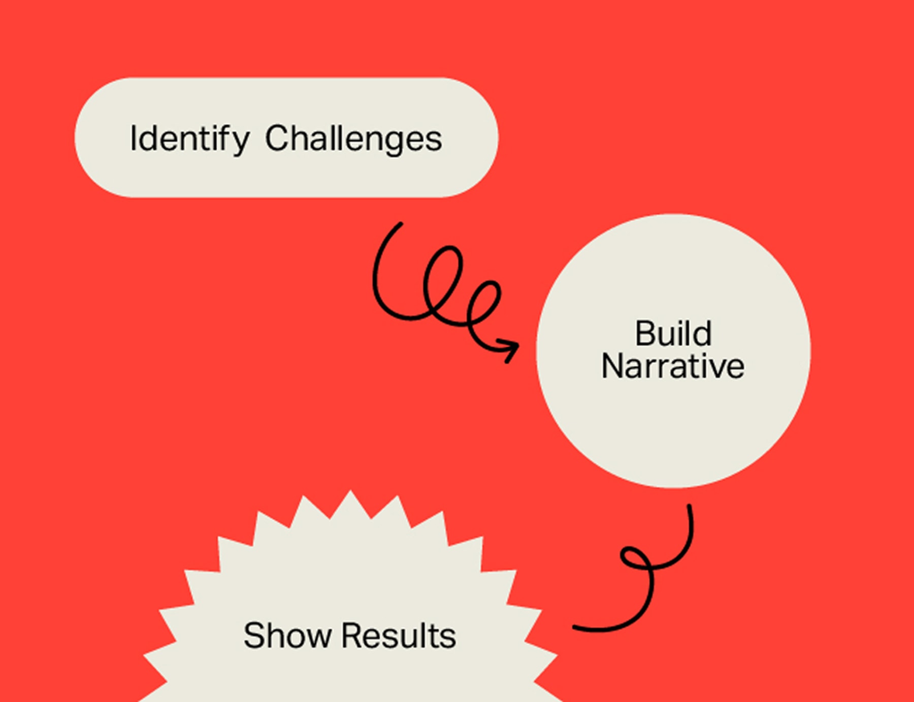
The Power of Case Studies in Service-Based Businesses
IN THE COMPETITIVE LANDSCAPE OF SERVICE-BASED INDUSTRIES, ESTABLISHING CREDIBILITY AND DEMONSTRATING EXPERTISE ARE PARAMOUNT.

Fill in the form below, and we’ll get back to you as soon as possible.