


Frozen food shelves are filled with bold images of nuggets, fries, and oversized labels shouting "ready in 5 minutes" or "just heat and serve." Our first challenge was to stand out and grab shoppers' attention in this crowded space.
We approached the project with a simple but effective idea: create a logo which doubles as a label - one that doesn’t overshadow the product but improves it. The result? A recognizable logotype housed in a consistent shape across all packaging.


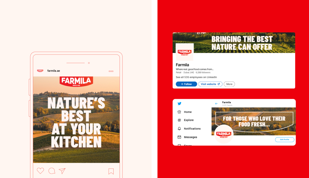
To make Farmila stand out, we broke away from the typical blue, green, and brown palette of competitors and chose a bold, vibrant red. Paired with big, condensed typography, it creates a striking contrast with clean, simple product photography.
When applied to the packaging, this system delivers maximum impact - grabbing shoppers attention at first glance and making sure they get the message once they pick up the product, with exciting copy that emphasizes Farmila’s natural and fresh produce. It’s all about making a lasting connection beyond the aisle.

A refreshed Farmila that people continue to love! Since our rebranding, Farmila has been going strong, offering convenience and delivering nature’s best to the plates of thousands of consumers.

-min.jpg)
.jpg)


