


We began by examining what makes Shokri the thriving company it is today. While sourcing fresh produce from around the world may seem straightforward, doing it for over 40 years - while consistently earning the trust of countless brands - is a whole different story. What’s kept Shokri thriving is their relentless commitment to excellence. For them, it’s always been about who they are, more than what they do.
Our creative team developed Shokri's new tagline: Rooted in Excellence, a line that serves as their promise while also paying homage to their humble beginnings, with work ethic and a never-say-die attitude as their main capital. Steering clear of predictable jargon such as "organic" and "natural," the tone of voice reflects Shokri’s blue-collar spirit: hardworking, trustworthy, and above all, committed.


In terms of identity, the first step was to simplify the name, officially rebranding as "Shokri" instead of Shokri Hassan Trading Co. It marked their evolution from a family-run business to a larger institution people trust. We then developed a logomark to embody this promise - a simple yet powerful shape that instantly communicates Shokri's mission. A fitting symbol for an iconic brand.
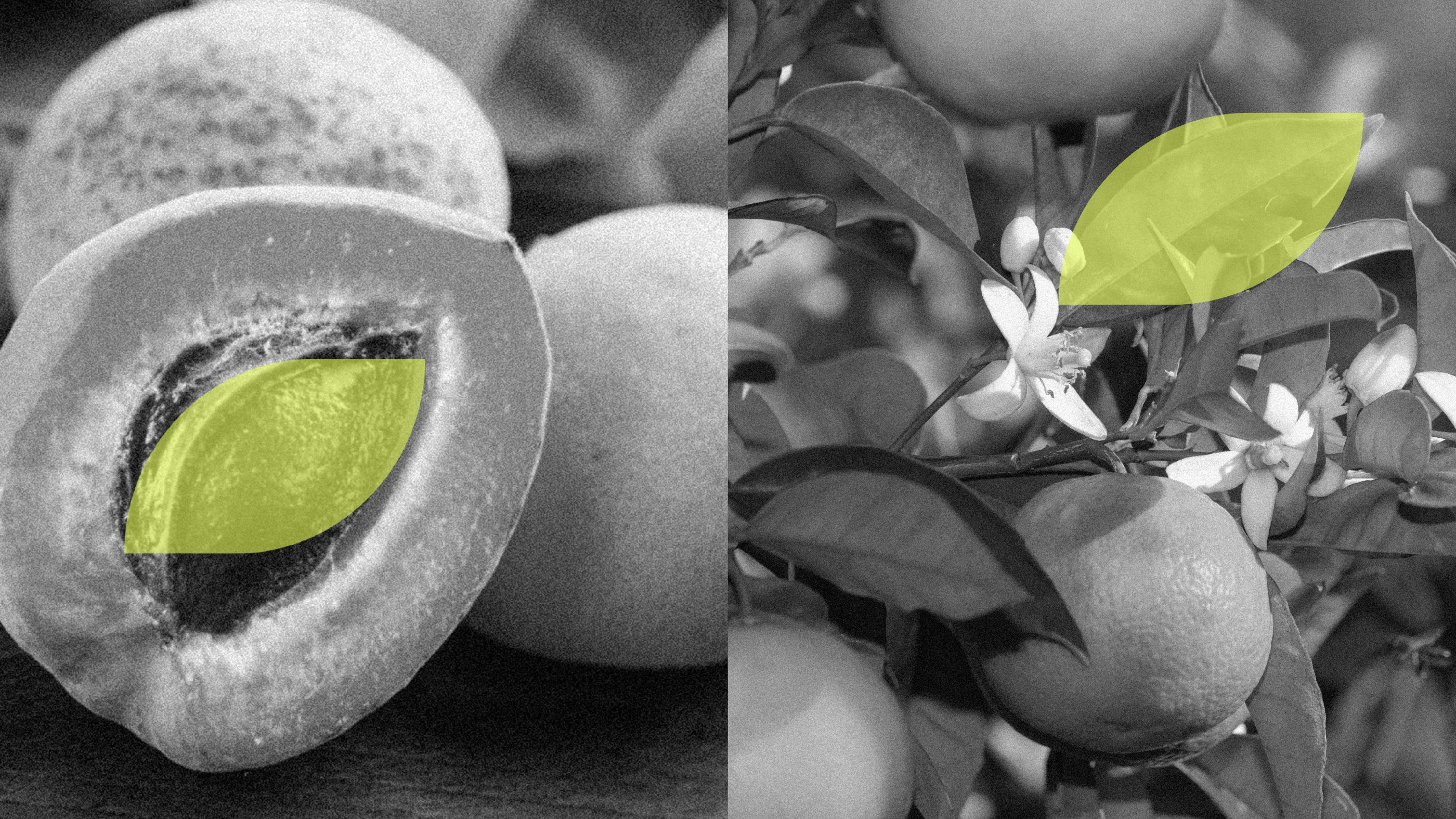
We created a set of modular key graphics to reflect Shokri's personalized approach to delivering the freshest produce, tailored to each customer's needs. The final touch was an energizing color scheme of neon green and dark green, departing from the usual leafy greens and earthy browns, resulting in an identity that embraces modern boldness while remaining rooted in simplicity.

Today, Shokri is a multinational fresh produce supplier with a growing list of clients across the region. They serve over brands and institutions, from five-star hotels and restaurant chains to hypermarkets, supermarkets, and even army camps.

-min.jpg)
.jpg)


