UI/UX DESIGN
Every screen in a digital product, web or mobile, is a decision point where the user either keeps going or drops off. Our work is building products that keep them going, from product strategy and information architecture through to the prototypes that prove the experience before any code gets written.
Every screen in a digital product, web or mobile, is a decision point where the user either keeps going or drops off. Our work is building products that keep them going, from product strategy and information architecture through to the prototypes that prove the experience before any code gets written.
Products are different from marketing sites. A marketing site has to convert a single visit into a single action. A product has to keep working for the user across hundreds of sessions, where every friction point adds up and every confused flow ends in an abandoned account. The design has to hold up on the thousandth screen as much as the first.
Strong UI/UX work pays for itself before the first line of code gets written. Prototypes catch flow issues that would have cost weeks of engineering to fix later. Component libraries cut feature build time by 50 to 70 percent. Information architecture decisions made up front prevent the rebuild that always comes when the team realises the wrong abstractions were chosen.
Why it matters
BAD UX IS ASILENT TAX ON GROWTH
Every confused user who quits is an acquisition cost paid for nothing and a referral that never gets made. Good design catches those moments early instead of in churn reports six months after launch.
UI/UX DESIGN SERVICES
Every UI/UX design project we run covers these elements, scoped to the product stage, the screen count and the level of design system depth the team needs to scale on.
UI/UX DESIGN SERVICES
Every UI/UX design project we run covers these elements, scoped to the product stage, the screen count and the level of design system depth the team needs to scale on.
PRODUCT STRATEGY & FEATURE SCOPING

salfa
USER FLOW MAPPING

akrim
WIREFRAMING & INTERACTION DESIGN
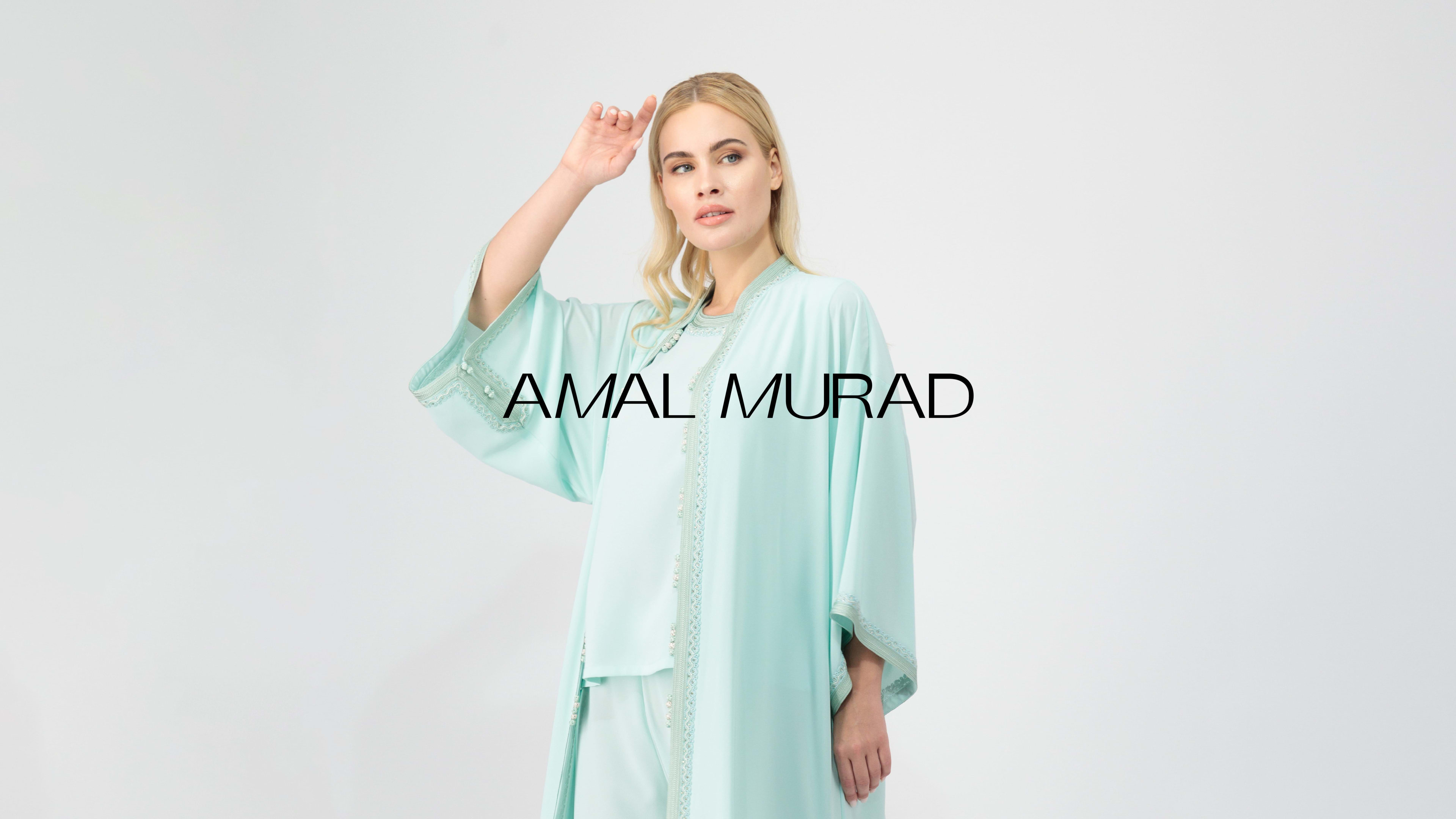
amal murad
UI DESIGN & COMPONENT LIBRARY

uaeglp
INTERACTIVE PROTOTYPES IN FIGMA
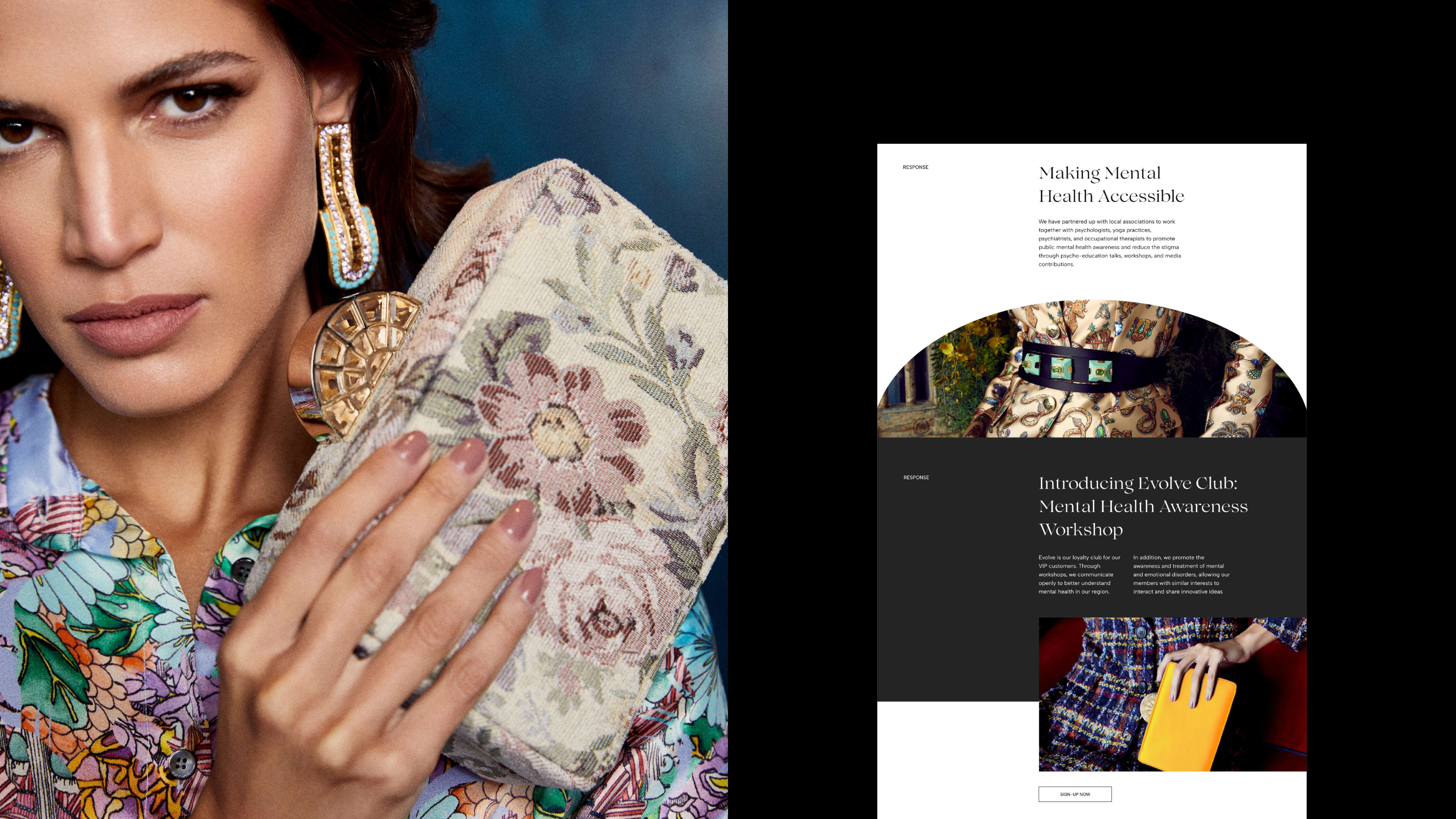
bysk
WCAG ACCESSIBILITY & DESIGN QA

lune
OUR UI/UX DESIGN
PROCESS
WHY UI/UX DESIGN MATTERS
REDUCES USER ABANDONMENT & FRICTION
SPEEDS UP DEVELOPMENT WITH A READY COMPONENT LIBRARY
LIFTS CONVERSION ACROSS PRODUCT FLOWS
MAKES THE PRODUCT FEEL PREMIUM
LOWERS LONG-TERM COST BY PREVENTING REBUILDS
WHY CHOOSE
HUMAN SAUCER
Strategic foundation
Every product starts with a clear strategy built around audience, core jobs, and business goals.
Component library included
Every product comes with a reusable component library that speeds up new features and keeps the design consistent.
WCAG-compliant design
Accessibility is built into the design system to meet WCAG 2.2 AA standards from the start.
Clear developer handoff
Designs include prototypes, specs, interaction states, and edge cases so developers can build directly from Figma.
FAQ
HOW IS UI/UX DESIGN DIFFERENT FROM WEBSITE DESIGN?
Website design covers marketing sites, where the goal is converting a single visit into a single action. UI/UX design covers digital products, where the goal is keeping users active across hundreds of sessions. The deliverables, the depth of the design system and the focus on flows over pages all change between the two.
WHAT PRODUCTS DO YOU TYPICALLY WORK ON?
We work most often on iOS and Android apps, SaaS dashboards, customer portals, e-commerce checkouts and complex web platforms. The design is adapted to native iOS Human Interface Guidelines, Material Design on Android or the responsive web standards the engineering team is building on.
WHAT DO YOU HAND OVER AT THE END?
We hand over a Figma file with full prototypes, the component library and the specs the engineering team needs to build from. Most clients build with their own development team, and we stay available to answer questions through the build.
HOW LONG DOES A UI/UX DESIGN PROJECT TAKE?
Audits and small feature redesigns run 2 to 4 weeks. MVP product design runs 8 to 12 weeks. Complex enterprise products with multiple flows and a full design system run 16 to 24 weeks or more. We share a clear scope, screen list and timeline upfront so there are no surprises.
DO YOU PROVIDE A COMPONENT LIBRARY OR DESIGN SYSTEM?
Yes. We hand over a component library in Figma alongside the product design, covering colour values, type sizes, spacing rules, components, interaction states and usage guidelines. The system is what makes the product cheap to grow and consistent to maintain after launch.
DO YOU DESIGN FOR ACCESSIBILITY?
Yes. We design against WCAG 2.2 AA standards, covering colour contrast, focus states, keyboard navigation, screen reader hierarchy and motion preferences. Accessibility is part of the quality bar, built in instead of run as a checklist at the end.

Fill in the form below, and we’ll get back to you as soon as possible.